Side-Channel Statistical Analysis
31 Jan 2021
Tags:
ctf
protocol analysis
visualization
Without a good intuition of what packet fields to consider, finding side-channel data in packet captures becomes a bit harder. While wireshark provides some statistics views to summarize conversations, we may desire to look into other packet details as well.
Our main focus is to find data points that differ significantly from others, i.e. outliers.
I’ll describe some approaches for these types of datasets, considering the trade-offs of each approach.
Eyeballing
Let’s start with an example, the CTF task Patience from BalCCon2k20. One of its writeups alludes to eyeballing tcp duration differences (on wireshark, under Statistics > Conversations):
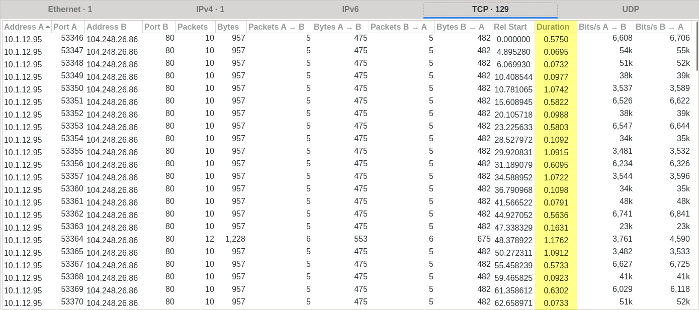
Which are more explicit in an I/O Graph for the field tcp.time_delta:
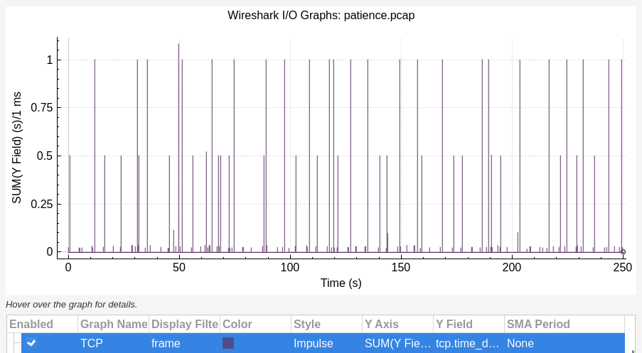
From the observed 3 ranges of values (around 0, 0.5, and 1), we can map those to morse code characters (where one of them is used as delimiter).
These views are ideal if eyeballing does lead you to them. Previously, I’ve written about the CTF task RFCLand, where the needle was in field ip.flags.rb, an uncommon field which easily goes unnoticed in this approach.
Visualizing packet fields
Some data cleaning is required before attempting to visualize these values.
Given that some of them are numerical, others categorical or string data, we can map all non-numerical variables to numerical, by assigning each distinct value its own number. Missing values are assigned with an infinite value. Finally, output as csv:
tshark -r patience.pcap -T json > patience.json
./packets_to_csv.py --type float patience.json
Given multiple variables, all countable and ordered, we can plot them with small multiple bar charts, sorting figures based on the approaches described below.
Tukey’s Fences
./multiple_bar.py -f patience.json.float.csv --strategy tukey_fences
By calculating quartiles from standard deviation, a range can be defined to identify outliers: points which aren’t contained in that range.
However, this doesn’t give a good idea of other groups of values in our dataset. Depending on how points are distributed, most of them could end up being classified as outliers.
Clustering
./multiple_bar.py -f patience.json.float.csv --strategy clustering
To get a better quantification of “density” between points, we can use clustering algorithms, such as DBSCAN.
Based on its paper, we define the following parameters:
eps: threshold for distance between 2 neighbor points;min_samples: minimum number of neighbors to consider a point to be inside the cluster (in our case 4, since we will apply it per variable, therefore <= 2 dimensions);metric: distance function, in our case euclidean distance.
Epsilon (eps) can be estimated by taking the derivate closest to 1 at the “elbow” of a curve where sorted distances between data points are plotted. In some cases the derivate isn’t valid, so we fallback to using half of the smallest distance between the closest 2 points.
Comparisons
Ideally, variables containing side-channels should appear before other variables, so that the reader has to go through less irrelevant figures.
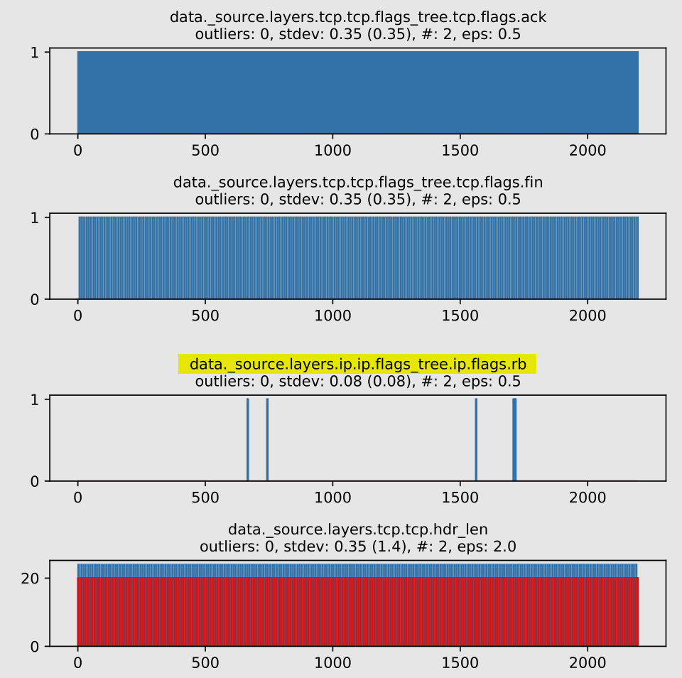
Task: Patience
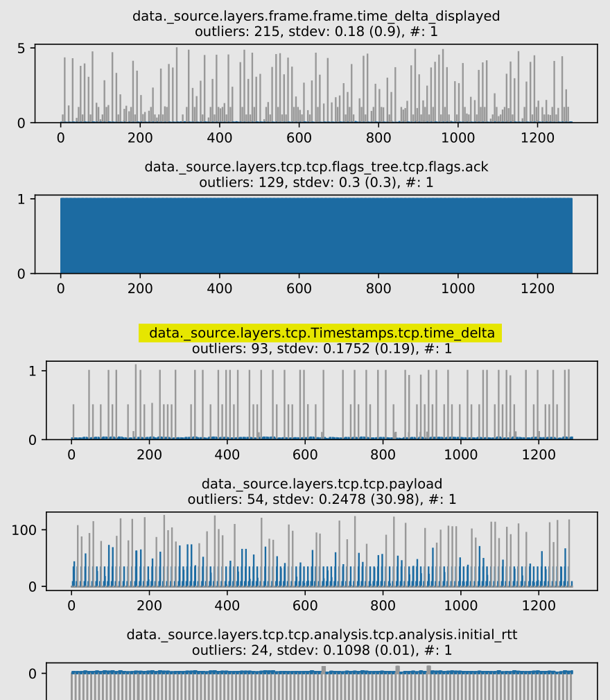
Here’s how Tukey’s Fence handles these packet fields (# denotes number of clusters, outliers are encoded in grey, non-deviating values are encoded in blue):
Position: 15th out of 193 figures
Most points were misclassified as outliers.
To understand why, let’s calculate expected morse character frequencies, based on English letter frequencies:
{".": 59.30666666666667, "-": 40.67333333333334}
On our payload, we have the following frequencies:
{".": 47, "-": 40, " ": 42}
They approximately match the expected frequencies, so the . characters skews the standard deviation towards it. There are 93 outliers, which is close to the sum of the other 2 characters (40 + 42).
However, with DBSCAN (outliers are encoded in grey, clusters up to a defined limit are encoded with distinct colors):
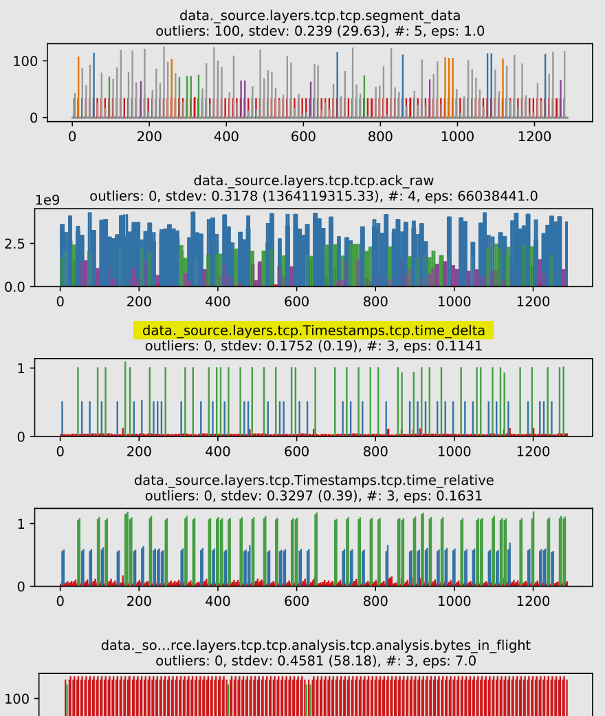
Position: 11th out of 193 figures
Note how we get 3 clusters, and all points fall into one of them, so we don’t get outliers. A much better match with the actual side-channel values.
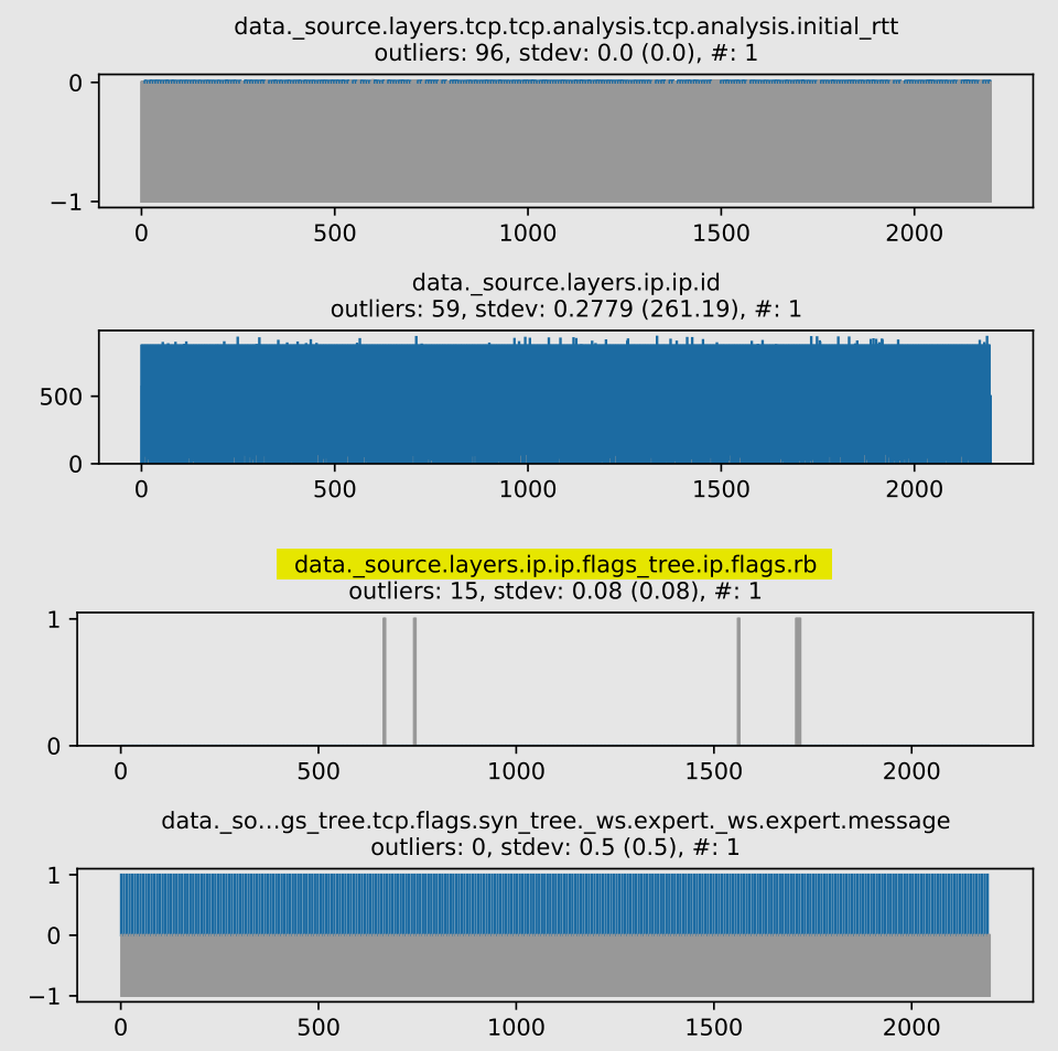
Task: RFCLand
Some cases don’t work so well with DBSCAN:
Position: 45th out of 112 figures
The actual side-channel values are identified as 1 of 2 clusters, but ideally, we should have one single cluster, with all side-channel values represented as outliers. Furthermore, since we are sorting by decreasing number of clusters and variance (stdev and eps), the figure ends up ranking in a lower than desirable position.
Compare with Tukey’s Fences:
Position: 19th out of 112 figures
Outliers are correctly identified, since the standard deviation is skewed towards non-side-channel values in our side-channel variable. Since our sorting criteria considers outliers first, it gives a better position when compared to the previous approach.
While we don’t have any winner approach here, it is nice to go through both of them, as they evidence distinct features about these datasets. Given this conclusion, it’s hard to say how the sorting could be tweaked to further improve positions.
Further work
- DBSCAN could be applied across the whole dataset instead of for each packet field. Given the high-dimensionality (there would be as many dimensions as packet fields), some feature selection would be needed;
- Matplotlib figure drawing is slow (System: CPU: Intel i5-4200U, RAM: 12GiB DDR3 1600 MT/s), as it takes around 8 minutes to render a pdf with 193 figures, each containing 1287 data points. I’m considering moving the rendering to D3.js.